


This is an archived article that was published on sltrib.com in 2011, and information in the article may be outdated. It is provided only for personal research purposes and may not be reprinted.
What's the best way to send off a prince of evil?
For Colin Smith, it began with a concept and ended with a period.
In between he tied an old image to a new story, he gave a nod to Time Magazine's treatment of Hitler, and he delivered a lesson in the power of a single word — all in less than two hours.
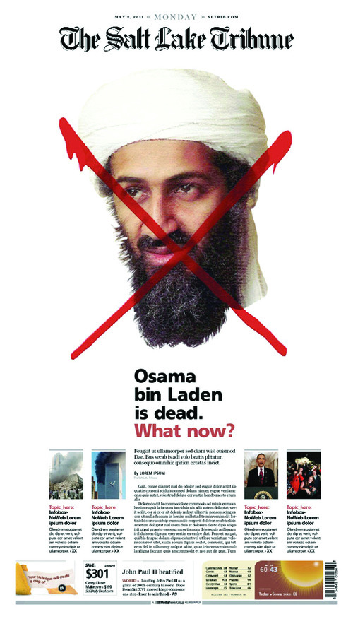
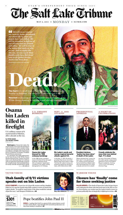
Colin's front page design for Monday's Salt Lake Tribune was not radical, but it was powerful: a simple portrait of Osama bin Laden in camouflage next to the minimalist headline: "Dead."
The design was selected by Newseum, the Washington, D.C.-based journalism museum, as one of the nation's top 10 front pages on that most momentous day, and it also helped power a 30 percent increase in single-copy sales that day.
As director of design, Colin is our king of visual communication. How The Tribune presents the news is largely because of his vision and persistence. Interestingly, when he got the call about 9 p.m. Sunday telling him he had a handful of minutes to make visual history, Colin focused on words.
"I typically start with a working headline then devise a design to support the tone of the story. Even if that headline changes later on (and oftentimes it does), having words in mind helps me incorporate the most important elements of the story, without letting a design become visually distracted by other facets of coverage. Using Monday's cover as an example, I started by skimming the main story and, realizing its focus was mainly on the breaking news of Osama bin Laden's death, designed a page under the assumptive headline 'Osama bin Laden is dead.' If the story had been about celebration, international reaction or even the president's speech, I would have chosen different visuals. But, seeing as it was about bin Laden, I realized the best image would be a file photo of the terrorist."
Before settling on his final design, Colin took one shot at something different, an homage to Time Magazine's famous Adolf Hitler cover: bin Laden's face with a dripping red X slashed across it. But management wasn't quite willing to go that far.
After he had settled on the final design, the headline words did indeed change, but it was Colin himself who boiled it down to its four-letter essence. "Based on the story, I always had the working headline 'Osama bin Laden is dead' floating around in my mind. When I placed the large, distinctive image of bin Laden on the page, I realized that having his name in the headline would be repetitive."
But he wasn't done. He added a twist, something we generally don't do with our headlines. He punctuated.
" 'Dead' is just a word, and what I needed was a statement," Colin recalled. " 'Dead' followed by a period implied a certain finality. The end. Case closed. Chapter over. For me, dead with a period paired with a photo of bin Laden spoke volumes more than just the word would ordinarily conjure."
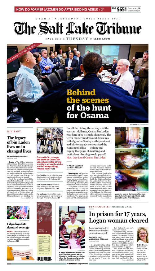
The next day, Colin went a different way again. The day after President Barack Obama made his historic announcement, the White House released images from the "situation room" taken during the bin Laden raid. These powerful photographs showed the nation's best and brightest intensely focused on a mission of world-shaping importance.
Most papers chose the image with the president and his staff intently staring at a screen to, presumably, get a real-time view of the raid. We ran that photo inside the paper. Out front we went with another photo of the situation room shot from behind the president, with the headline, "Behind the scenes of the hunt for Osama."
"I ended up pushing for the image we eventually ran on the cover because I thought it better introduced the story," Colin explained. "While the cover photo by itself isn't all that spectacular, pairing it with a 'behind the scenes' article and a main magazine-style analysis headline helped set the tone more quickly and unambiguously than the other photo would have allowed."
For Colin, it's never about a single element. "Newspaper design is, essentially, the art of synergy — creating an overall experience that is greater than the sum of its parts."
The end. Case closed. Chapter over.
Tim Fitzpatrick is deputy editor of The Salt Lake Tribune. He can be reached at fitz@sltrib.com.