

This is an archived article that was published on sltrib.com in 2016, and information in the article may be outdated. It is provided only for personal research purposes and may not be reprinted.
It's essentially the Google Maps of state wildfires.
Launched Thursday, the Utah Department of Natural Resources' newly developed, interactive site — http://www.utahwildfirerisk.com — allows users to search for and zoom into particular neighborhoods or recreation areas on a statewide map to see the wildfire risk in that zone.
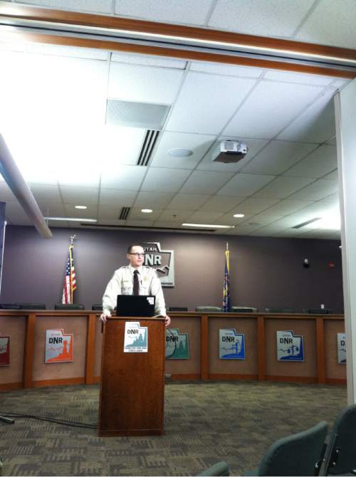
"It's going to change the conversation about wildfires," said state forester Brian Cottam.
The idea behind the map, Cottam said, is prevention. The site pulls in state and federal data to create a "risk assessment portal" where the public can generate a report detailing how to reduce fire danger near homes, such as by removing excess vegetation.
After clicking on a specific area, what the site calls "assess your location," the map pulls up a color-coded indication for the threat. Red patches — indicating the highest risk on the scale that ranges from "very, very low" to "extreme" — currently cover central and southwestern Utah. The algorithm is based on probabilities, Cottam said. Just because an area is red doesn't mean there will be a fire, but it is likely.
Though the site does not show active fire zones, users can choose different map "themes," such as vegetation, historical fire locations and land ownership boundaries, that display different ways to view fire danger.
"This is a spectacular tool that provides information that we've never had all together in one place previously," Cottam said.
Nate Barrons with the Utah Division of Forestry, Fire and State Lands has helped develop the site over the past two years. It might be hard, he said, for a homeowner to walk into their yard and assess any risks; the public portion of the site provides a "functional, easily accessible tool" to visualize data and manage threats.
The site will "catalyze conversations within communities," Barrons said, about what can be done to make neighborhoods less prone to fires.
State land managers can access the professional portion of the site, which requires a password, offering more detailed information and generating an in-depth 80-page report (the public report is four pages). Officials from multiple agencies have beta tested the map to prioritize prescribed burns for high risk areas, Barrons said.
State data on the site will update annually, while federal data feeding the map will change every three to five years. Utah is the first state to significantly optimize the data sets, Cottam said, giving it the "most technically advanced, most fire-science-informed" map in the nation.
"Anyone is going to be able to access information to learn more about the threat of wildfire, the risk of wildfire and what the impacts might be in their communities," he said.
The map's resolution is a slightly lower quality than Google Maps, meaning the site generalizes data over broader areas. One pixel on the wildfire map encompasses a 90 x 90 foot area, or 30 meters, while Google's is about six inches.
The state partnered with geospatial developer Timmons Group to create the $250,000 site.
Twitter: @CourtneyLTanner